Ford Labs
This project entailed designing a digital space tailored for FordLabs employees to recognize birthdays, accomplishments, milestones, and other events, providing FordLabs employees with a cost-effective, collaborative, and user-friendly platform to celebrate each other within the organization.
Duration: 4 Months
Role: UX/UI
(team of 10)
Tools: Figma, Miro, Canva
Deliverables: High-Fidelity Mockups
Employee recognition and celebration are significant in increasing work motivation and efficiency. Currently, they are using a platform called Kudoboard. While it does the task at hand, Ford Labs wants a better solution.
First, let's start with Kudoboard. What is it?
Kudoboard is an online platform that allows users to create and share digital greeting cards or messages for many occasions. It can be used as a virtual bulletin board for sharing messages, photos, and videos, and for various other purposes.
Why does Ford Labs need a new platform? Well, let us take a look!
Who is Ford Labs?
As a dedicated team within Ford, FordLabs partners with Ford businesses to solve significant problems by developing digital products and services in a lean, human-centered fashion.
Let's Break It Down...
Project Timeline
Ford's Work Culture
We interviewed five FordLabs employees to understand their current interactions, identify needs for virtual celebrations, explore existing systems such as Kudoboard, Slack, and Webex, and uncover any pain points in their celebration processes. We broke down our findings into categories like:
-
Celebratory efforts were demonstrated virtually and in person between coworkers
-
Entailing the methods by which co-workers interact both during and outside of office hours
-
Describing the communication platforms FordLabs employees utilize
-
Features that interviewees found useful and straightforward

Affinity diagram created after interviewing Ford Labs Employees
So what did we gather from this?
-
Employees appreciate various features that allow them to express their personalities within time constraints.
-
They prefer websites with simplicity for easy navigation, so that it’s quick and easy to find what the user is looking for.
-
In conclusion, the platform should be quick and easy to use, have GIFs, emoji reactions, and themes, and include calendar notifications
Assessing the Market
We explored ten employee celebration platforms similar to Kudoboard. We broke down each platform by features, price, and board types, and compared them to Kudoboard. This helped us identify features to include in our model, understand the significance of Kudoboard, and inform our decision-making process. We used these factors for our comparison:
-
Price
-
Type of boards
-
Main features
-
Similarities/differences

Competitive analysis of competitors presented on a Miro board
From our research, we found three major features to add to our design:
-
Adding a calendar feature to track birthdays, anniversaries, and work events would improve organization within our platform
-
A possible point system, initiated by managers rather than being transactional, could also enhance our platform
-
Allowing gift card donations within birthday posts for users to show appreciation for one another
The First Round of Ideation
For the "Sketches and Ideation" phase, we generated innovative ideas by drawing inspiration from our primary and secondary research. Specifically, we want to identify functionalities that could enhance our digital platform model. We wanted this process to be quick and well-rounded, so we did a round of crazy 8s and dot-voted on our favorite features.

Some of the sketches from our crazy 8 sessions
Our takeaways
Our approach allowed us to efficiently explore a wide range of ideas by drawing insights from diverse digital platforms. The exercise helped us identify innovative functionalities that could enhance our digital design space model. This process laid a strong foundation for the subsequent development and refinement of our potential solution.
Conceptualizing our Site Flow
After our preliminary research, we took time to understand how we want FordLabs employees to navigate features seamlessly on the website, and to create a board for celebrating and recognizing their co-workers. Our team developed a site flow to visualize how the site might look and function, drawing inspiration from our sketches and findings in milestone 1.
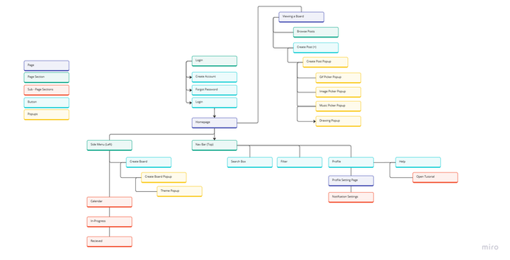
Detailed site flow created on Miro showcasing possible user flows
We narrowed our flow into three main categories for better understanding

Brainstorming the Design System
After our initial research and understanding of who the Ford employees are, we got a clearer idea of what the celebration app should represent. Our group created a mixed moldboard of different styles and ideas we thought would fit best, and discussed which elements, color, typography, and color scheme we liked the best.

Moodboard of design styles and UI isnpiration presented on Miro
From this mood board, we jotted down what our team favored most and all the elements that received the most votes.
-
Simplicity - consistent font even tho the sizers are different
-
Instagram-styled "posts"- promote a sense of community
-
Vibrancy and graphics - seems celebratory
-
Professional and fun fonts
-
Rounded card edges
-
Bright colors and a simple look
-
Good indicators to know what buttons do
-
Open, airy, and playful vibes
-
The opposite of a corporate look
-
Consistency with mobile and website
Leading us to our final design system!

After all of our scribbling and researching, where was our halfway point? Let's take a look!
Our Initial Mockups


Finalizing our Designs
After completing our mid-fidelity wireframes, we received a lot of constructive feedback to help better our final solution. We also added our final design system and interactions.
To understand what we changed, here are some of the reviews our team received after usability testing
User A
"Side menu bars are way to overbearing....this is all very confusing."
User B
"Way too many functions, I dont think i'll every use half of these."
User C
“I like the emojis, but what happens when there are multiple events will it get crowded?”
These reviews led us to re-work and get to our final solution :)

Go Home
01
Next Steps?
Our designs were given to the company and passed over to the software engineer interns the past summer to bring our visions to life!
Project Reflection
This was my first year working on Experience Studio, and I had a lot of fun learning and experimenting with UX fundamentals. We had a lot of freedom when it came to designing and choosing the solution for our project prompt. I never knew that so much research went into designing. I’ve learned firsthand that without research to back up our designs, our designs wouldn't be successful. We researched, sketched, and finally created our hi-fis. I worked with the group that helped plan and create the homepage, although we all helped each other in designing in editing. My group was in charge of coming up with the foundation plan for the homepage. I have a clearer understanding of the UX process, and I hope I can get better at following this process for my future projects. I am so thankful for this opportunity that our sponsors gave us; hopefully, I can work with them again.
Contributions
On this project, we worked as a team hence no part was done more by a certain individual. However, initial drafts and research for the calendar and home page were done by Damaris Adeniji, Claire O’Malley, and me.